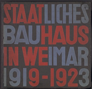
 Bauhaus’ geometrical abstraction influences us today.
 At the end of 1925, the bauhaus abolished capital letters in all their printed materials. the bottom of each piece of bauhaus paper read:
“we only use small characters because it saves time. moreover, why have 2 alphabets when one will do? why write capitals if we cannot speak capitals?”
 |  |
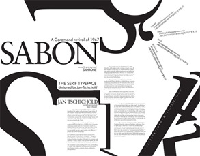
Jan Tschichold was one of the most outstanding and influential typographers of the 20th century. The significance of his influence on the print industry and designers in Europe and the USA is uncontested and his famous typeface Sabon is still a bestseller. In honor of his 100th birthday, Linotype is dedicating this review of his life and work.
 |  |
Helvetica type is a good typeface to use. Arial is a bastardisation of Helvetica.
 |  |

