Found this interesting post on:
http://phresh.gr/2010/01/the-design-uk-road-signs/
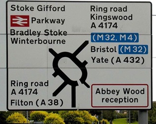
In 1957, the United Kingdom’s Department of Transport appointed an Advisory Committee on Traffic Signs for Motorways. Jock Kinneir and his assistant Margaret Calvert were appointed as graphic designers to it.

Instead, they developed a more rounded typeface called “Transport” with distinctive tails to ‘a’, ‘t’, and ‘l’, and bar-less fractions, all of which helped legibility.

Margaret Calvert was the one who came up with simple, easy-to-understand pictograms, most notably the signs for ‘men at work’ (a man digging), ‘farm animals’ (a cow), and ’schoolchildren nearby’ (a girl leading a boy by the hand, whom she later revealed to be herself), based on pre-existing European road signs.
 |  |
Marion Deuchars & Margaret Calvert have been working together and they recently produced a work of art in nine sections, celebrating the 50th Anniversary of the completion of the M1.


