Saturday, 30 January 2010

Design Tips

penguin 
  • Don’t underline anything (underlining was only used with typewriters).
  • Capital letters are more difficult to read.
  • Only use capital letters for emphasis, and only if you have to.  Make the caps smaller than the rest of the typeface so they fit within the surrounding text.
  • Kerning and Leading – you can kern in Quark and InDesign.
  • Use Leading for emphasis/de-emphasis.
  • Make sure your typeface is readable and legible.
  • Look at the spaces in the book – how do they work?
  • Make a grid in In-Design to work within.
  • Decide on the paper quality you want.
  • Paper proportions (A4, square, etc).
  1. KISS – Keep It Simple, Stupid!
  2. Smaller text.
  3. More white spaces.
  4. The PICTURES are the story.
  5. Contrast and tension.
Order out of Chaos
  • Repeatability
  • Composition
  • Communication
Five Steps to Good Design
  • Consistency.
  • Hierarchy.
  • Typography (fonts).
  • Materials (paper, etc).
  • Layout (grids, margins).

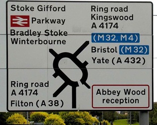
The Design Process of UK Road Signs

Found this interesting post on:

http://phresh.gr/2010/01/the-design-uk-road-signs/

road sign 01

In 1957, the United Kingdom’s Department of Transport appointed an Advisory Committee on Traffic Signs for Motorways. Jock Kinneir and his assistant Margaret Calvert were appointed as graphic designers to it.

uktransport font The committee looked at examples from other European states as well as the USA but Kinneir and Calvert found them somewhat harsh and unsatisfactory.

Instead, they developed a more rounded typeface called “Transport” with distinctive tails to ‘a’, ‘t’, and ‘l’, and bar-less fractions, all of which helped legibility.

roadsigns_type Until today, two forms of their typeface exist: Transport Medium and Transport Heavy. Both have the same basic form, but Transport Heavy is boldface, to allow easier readability for black letters on white backgrounds, such as those used on non-primary roads, while Transport Medium is lighter, and is used for white letters on dark backgrounds, such as the blue motorway signs or the green primary route signs.

Margaret Calvert was the one who came up with simple, easy-to-understand pictograms, most notably the signs for ‘men at work’ (a man digging), ‘farm animals’ (a cow), and ’schoolchildren nearby’ (a girl leading a boy by the hand, whom she later revealed to be herself), based on pre-existing European road signs.

roadsigns2 roadsigns4

Marion Deuchars & Margaret Calvert have been working together and they recently produced a work of art in nine sections, celebrating the 50th Anniversary of the completion of the M1.

Branding

Every company uses the same logo and typeface to define their corporate image.  The following from:
shows the evolution of the branding we see today:apple
The first Apple logo was a complex picture of Isaac Newton sitting under an apple tree. 
The complex logo was blamed for slow sales and Rob Janoff of the Regis McKenna Agency was commissioned to design a new one. Janoff came up with the iconic rainbow-striped Apple logo used from 1976 to 1999.
Janoff, however, said in an interview that he designed the logo as such to “prevent the apple from looking like a cherry tomato.”
In 1998, supposedly at the insistence of Jobs, who had just returned to the company, Apple replaced the rainbow logo (“the most expensive bloody logo ever designed” said Apple President Mike Scott) with a modern-looking, monochrome logo.
vw
The first logo was designed by Franz Xavier Reimspiess, a Porsche employee during an office logo design competition. The main part of the logo hasn’t changed much, but understandably after the WWII, they got rid of the design around the circle which seems to be inspired from the Nazi flag.

bbc The first attempt at proper branding came in 1953 when Abram Games was commissioned to design the BBC’s on-screen identity. He was famous at the time for designing the logo for The Festival of Britain of 1951.
His Television Symbol, shown right, was a brass model whose centre circles could rotate. For BBC Scotland the spot in the middle was replaced by a lion. There were also other regional variations as well as a matching clock.


Interestingly, Kodak was the first company to integrate its name and looks into one symbol in 1907. After 1935, Kodak predominantly used yellow and red colors and the complete name of the company. First time the Kodak name was completely written in the logo in 1935, which began the use of yellow and red colors as well.
kodak
In 1960, they tried to show a flip page as a logo, but was changed to a box and graphic “K” element in 1971. I think the logo in 1971 was quite trendy, but it might have been a little complex. Retaining the 1971 concept, there was a slight variation in the font in 1987. The new font looked contemporary.
Again, like other companies, Kodak decided to simplify their logo in 1996, and removed the boxes. The red color gives a more brighter and structured feel of the company. In 2006, again a slight variation was made in the logo with a rounded ‘a’ and ‘d’, to give a contemporary look.

shell

Back in 1900, when the company was started the logo was a realistic and simple shell which lies flat on the ground. This was a pectin or scallop shell, but today the company has a logo which is bold, colorful and much more simplistic.  With the advent of internet and fax machines over the later years, it became necessary for the company to simplify their logo, which would prevent it from being distorted in small images. The 1971 logo designed by Raymond Loewy is very simple as compared to the earlier logos.  This has helped the company because this logo is more memorable and recognizable, accountable to the simplicity of the logo. The 1971 logo is still used by the company albeit with minor changes, but it has become so recognizable that it often appears without the company name now.
pepsi

Today, one of the biggest soft drinks company, was first started by Caleb Bradham in 1890’s. Initially named as Brad’s drink the name was quickly changed to Pepsi-Cola, which is visible in the first 1898 logo. Finally in 1903, the name was trademarked and hasn’t been changed till date.
In the early years, Brad made custom logos for the brand as it became more famous. In 1933, the company was bought by Loft, Inc. The company changed the bottle size from 6 to 12 oz. and came up with the ‘Refreshing and Healthful’ logo.
However, the major breakthrough in the Pepsi logo design came in 1940’s. Walter Mack, the CEO of Pepsi came up with the idea of a new bottle design, with a crown having the Pepsi logo. The ‘Pepsi Globe’ emerged when USA was in WWII, and to support the country’s war efforts, Pepsi had a blue, red and white logo.
This logo became hugely popular, and went on to be the identifier for the company. As a result, in 1950 and 1962, this bottle cap with the swirling blue and red became prominent in the company logo. During the 1960’s when it became even more popular, the script was changed from the curly red, and the main attraction was on the bottle cap in the logo.
We see the first appearance of the Pepsi Globe instead of the bottle cap in 1973. The typeface was made smaller so as to fit in the globe. The Pepsi Globe was “boxed in”, with a red bar coming in from the left and a light-blue bar coming in from the right.
In 1991, the typeface was moved from inside the globe. The red bar was lengthened and the typeface came on the top of the globe. In 1998, the white background in the logo was replaced by the blue color, which also resulted in dropping the red horizontal band. The globe now had 3D graphic and larger than earlier versions. It might be that since, Pepsi and the globe touch each other for the first time in the logo, the name ‘the Pepsi Globe’ was given to the logo.
After 1998, it seems that Pepsi had decided to give the globe more prominence than the script itself. So, the globe came on top of the script in 2003, and in their current logo they have done away with the script altogether.

Typography

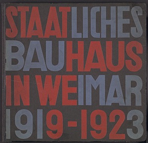
bauhaus  Bauhaus’ geometrical abstraction influences us today.
At the end of 1925, the bauhaus abolished capital letters in all their printed materials. the bottom of each piece of bauhaus paper read:
we only use small characters because it saves time. moreover, why have 2 alphabets when one will do? why write capitals if we cannot speak capitals?”
 
 bauhaus2 bauhaus3


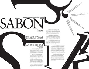
Jan Tschichold was one of the most outstanding and influential typographers of the 20th century. The significance of his influence on the print industry and designers in Europe and the USA is uncontested and his famous typeface Sabon is still a bestseller. In honor of his 100th birthday, Linotype is dedicating this review of his life and work.
tishold sabon

Helvetica type is a good typeface to use.  Arial is a bastardisation of Helvetica.

 HELVETICA_FONT HELVETICA_FONT 2

Book Design

pencil of nature Now I’ve got to grips with the basics of In Design, I can now think about design. 
It is not necessary to have words in a photobook – you can just have images in it, or you can write an essay in the front – it’s up to you.  However, the content of the photobook should sustain the interest in wanting to delve further into the book.


William Henry Fox-Talbot’s book ‘The Pencil of Nature’ was not originally produced as a book – it came as a series of images that you bound as a book yourself.
 
It was an early photobook, but wasn’t published.  It is inconsistent and has no narrative.
pencil of  nature inside

Werner Graff’s ‘Es Kommt der neue Fotograf! was published in 1929 and was a hybridisation of what is a photo and what is a graphic image.
 
werner graff werner graff 2
 
‘An American Exodus’ by Dorothea Lange and Paul Taylor has an inconsistent page layout which varies the relationships between images and text, but there is a narrative in the book – it has its highs and lows.
 
 american exodus exodus 01

americans 
 
 
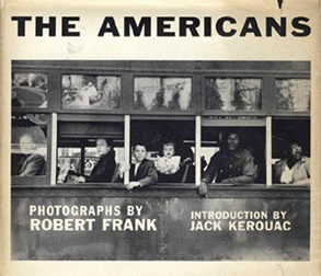
‘The Americans’ by Robert Frank contains lots of white space which let the images ‘breathe’.  I think I may do this (not ‘white’ though).


hiromix 
 
Hiromix’s ‘Girls Blue: Rockin On’ of 1966 is more of an event containing foldouts, etc.

Dewi Lewis Books

I’ve had a look through the new Dewi Lewis catalogue 2008/2009 which contains a range of books.   Look at the different book cover designs and subject matter.
 
41Q52Agt55L._SS500_
WHEN LIGHT CASTS NO SHADOW – EDGAR MARTINS
Edgar Martins was granted special airside access to some of the most interesting airports in Europe. Those he chose have had a key role in history or the history of aviation (for example the Azores, which was a compulsory stop for transatlantic flights prior to 1970 and a military base in both World Wars). Almost all his images were produced at night, using the aprons’ floodlights, moonlight, long or double exposures of between ten minutes to two hours.
DREAMS AND GOALS – ALISTAIR BERG
For every football fan the World Cup Finals are the most extraordinary celebration of the game. As we look forward to South Africa hosting the 2010 tournament, this outstanding collection of photographs by Alistair Berg captures fan culture around the world at its most vibrant and characterful.
Layout 1 
Allotments 
ALLOTMENTS – ANDREW BUURMAN
There’s something about the word ‘allotments’ that conjures up an image of traditional values, of balmy summer days spent working the land, escaping in honest toil. A rural idyll far removed from our everyday experience. And even though allotments can be found throughout the world, in our minds they still seem to encapsulate a certain Britishness.
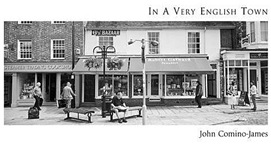
IN A VERY ENGLISH TOWN – JOHN COMINO JAMES
High Street, Buttermarket, Cornmarket, Pump Lane, North Street, Park Street, have such a deceptive familiarity to the English ear that they might be found in any English town. They are names that suggest a sense of continuity and tradition – something very English. Yet the reality is often not quite what it appears.
inaveryenglishtown 
I TOYKYO 
I, TOKYO - JACOB AUE SOBOL
"Initially I felt invisible. Each day I would walk the streets without anyone making eye-contact with me. Everyone seemed to be heading somewhere – it was as if they had no need of communication. Most mornings I would take the Chuo-line from Nakano to Shinjuku, and even though the train would be packed with salary-men and school girls in uniform, I rarely heard a word being spoken.
ZEBRATO – MICHAEL LEVIN
Using long exposures Levin reduces the landscape to elemental shapes. Each image has a simplicity and purity capturing the essence of the landscape. Many of his photographs feature water and clouds, and show what has been described as ‘the smooth skin of light’, yet it is the architectural intrusions into these clean spaces that most engage him. Wooden posts, concrete barriers, weathered rocks, dilapidated jetties, even the elegant shape of French topiaries introduce elements which seem to haunt the landscape and introduce a human presence.
ZEBRATO 
TRUNCATED 
TRUNCATED – PAUL HART
The forest interior is more architecture than landscape. Amongst the trees, your concept of time is changed. As you move deeper inside, and the outside world disappears, the wind is calmed and noise filtered, temperature is altered, and light is bounced and subdued. Some trees stand like sentinels, others are stolid in ranks, an army of trees appearing out of the dark. This apparent sanctuary of stillness can strangely transform.
THE LAST THINGS – DAVID MOORE
David Moore was allowed unprecedented access to a Crisis Management facility below ground in central London, between September 2006 and April 2007. This space will be used as the first port of call in any situation where the State is under threat. The environment is sustainable for extended periods and is part of a larger network. Over an 8 month period Moore was able to observe a live working space, continuously on standby, and fully prepared for the most extreme national emergency.
010523 
IN A WINDOW PRESTES 911 
IN A WINDOW OF PRESTES MAIA 911 BUILDING – JULIO BITTENCOURT
In March 2006 the residents of 911 Prestes Maia, a 22 storey ramshackle tower block in the centre of sprawling São Paulo, Brazil, were surprised to learn that they were to be evicted within 28 days. Whilst the building, neglected by its landlord, had apparently been empty for over a decade 1,630 people, including some 468 families with 315 children lived there. In 2003 the ‘Movement of the Homeless’ had moved in hundreds of homeless families. The new residents drove out the vermin and the drug dealers, and cleaned up the place, and the building became possibly the largest squat in the world, complete with a library, workshops and other educational activities.
COAL, FRANKINCENSE & MYRRH – TIM SMITH
The reputed home of the Queen of Sheba, Yemen has been at the crossroads of Africa, the Middle East and Asia for thousands of years thanks to its position on the ancient spice routes. Ten thousand years of trade along Yemen’s Red Sea and Indian Ocean coasts, over its mountains and across its deserts made it a meeting point of people, ideas, money and goods and the centuries of trading generated much wealth.
COAL FRANKINSENSE MYRRH 
INFECTED LANDSCAPE 
INFECTED LANDSCAPE – SHAI KRAMER
The accumulation of ruins and military remnants is an important part of what defines the Israeli landscape today – wounds in the landscape that correspond to the wounds in the Israeli collective consciousness.
LANDSCAPES – RICHARD BILLINGHAM
Over recent years Billingham has photographed increasingly within the landscape and this new book brings together this work for the first time. The images are contemplative and thoughtful and reflect his primary concern for the ‘making’ of an image.
LANDSCAPES
DINKY TOYS DINKY TOYS – KIM SAYER
Dinky Toys must be one of the most successful and collectable toys ever made. These delightfully stylish photographs feature models from the golden age of the Dinky toy – an era remembered fondly by every post-war baby-boomer.
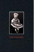
THE VISITORS – CHARLOTTE COREY
Charlotte Cory’s ‘Visitors’ are truly creatures of fantasy and fascination – each so delicately posed that we think “can that be real?” A noble tiger in full military regalia, a dejected donkey slumped in a chair in a sparse studio setting, a haughty kangaroo holding a cricket bat and gazing out at us dismissively. What kind of extraordinary creatures are these?
THE VISITORS

Tuesday, 26 January 2010

My First Book Design

I've had a bit of a play with InDesign.  I've never used it before, so I'm just learning as I go along.
book design 01

This is what I have come up with so far.  This image is strong enough for a front cover (the book doesn't have a white border around it, it is just to show where the borders are).
I messed around for a while with the lettering.  I would have liked the grey and orange that I’m using on the blog at the moment, but it doesn’t seem to go with the image and looks a bit ‘tacky’ and gimmicky for a book cover.  I’ll have to play around with the positioning, but this will be determined by what image I choose.  I don’t want the wording to interfere with the image detail in any way.
inside book design 01
 
Inside is very simple at the moment, but I may keep it this way – why over-complicate things just because you feel you have to do something fancy.  I was looking at Trevor Appleson’s book ‘Free Ground’ today and noticed that his book layout is similar – a picture on the right-hand page and a blank white left-hand page.  The left-hand page was blank.  I may include the interviews on the left-hand page, however, a bit like this:
inside book design 02


I have done the size at A4 for now, just to see what it looks like.  I think I will give the book a little extra height.  Looking at it, I think I will make the background colour black to give more of an impression of night-time.

inside book design black 
All said and done, I'm at a very early stage and I haven't even found anyone to photograph yet!

Sunday, 24 January 2010

Dewi Lewis

Publisher Dewi Lewis came to talk to us last week and offered some sound advice.
Exhibitions
Exhibitions involve a lot of work and are usually static (ie they don’t travel around the country).  Exhibitions are a partial closure of work, but books are a full closure.
The Economics of Publishing
Print Runs
Usually 1,000 to 2,000 printed.  Bookshops may only take 10-30 copies. It’s all done on a very small scale for photobooks.  Co-editions are books published in different languages.  You only have to change the black plate if all text is printed in black.  Co-editions are critical, particularly for books which have a lot of text.  Captions to images also need translating and reprinting.  With a photobook with a single page of text at the beginning, you can usually sell these abroad as it has limited text and doesn’t need a co-edition.
Retail Price
A hardback photobook retails for about £30-£35.  The publisher gets approximately 30% of the money made.  A £25 book will be to be produced for £5.  They are sale or return.  A 5-times mark-up is needed:
Production cost - £5.00
Retail Price - £25.
Prices have to come right down in some countries such as India and Eastern Europe.
Publication Costs
50% of photobooks you see in the shops are self-funded. 
Retailer discount – 45-50%
Wholesaler discount – up to 65%
Royalty – 10% net/5% book price – some photographers will take copies of their book instead as they can be used for pitching to galleries.  This is more effective than sending a CD or portfolio.  Books don’t make the photographer money, but you can take it to an agency and are excellent calling cards.
Marketing
Advertising is very expensive and not done for photobooks.
Editorial coverage – try to get features in magazines like the Guardian Weekend, Sunday Times or Independent – this can generate income for the photographer.  Also try photo magazines like BJP, Ag or Foto8.
National newspapers don’t really do book reviews on a photobook, but they review exhibitions.
Dewi Lewis encourage the photographer to get publicity:

  • In the town the photos were taken

  • In the photographer’s home town

  • Newsletters/websites of societies related to the topic or the photographer

  • In photo magazines and local magazines (City Life, etc)
You can sell your books in:

  • Local press

  • Bookshops

  • The tourist market
Book Launch
The press don’t generally attend book launches, so usually friends and family attend.  Try to do this for less than £200.
He advises to approach the photobook from a commercial standpoint.
Photographer Involvement
It is critical that photographers take an active part in their book.  They can, for example, write personalised notes to various people informing them of their book. 
 
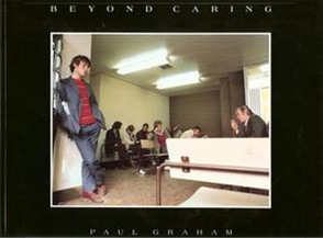
Paul Graham and Martin Parr both self-published their books initially and used these books to network, leaving them with people who may have a strong impact on their work.
beyond caring paul graham martin-parr-last-resort
 
Submitting Work
1       What are the publishers looking for?
They are looking for something which will be of interest to people worldwide. 
eg – work on the miners stroke wouldn’t be interesting to people in other countries.
eg - ‘Prisons in Italy’ project – would the UK market be interested in this?
eg - ‘Once Upon a Time in Wales’  contained photos of a small village in Wales, but this project was about a period of time and a sense of community, which gave it more chance of working abroad.wales
Try to go for international appeal on subject matter.  Is there human interaction?  Do we feel empathy for the people in the book?
1       Timescale
If you have a project which has some basis of time (ie the World Cup), you need to be thinking about it about 3 to 5 years before the event.
Dewi Lewis has to give 6 months notice of a new title before the book is launched and distribution schedules are very long.
1       How to Submit Work to Dewi Lewis
Look at Dewi Lewis website for more details.  Submission periods are in May and December.
They want to see 12 images and a brief outline of the project and also something about the photographer.  They accept CDs and PDFs in a slideshow format to make it easier for them to view, don’t just send a CD with pictures in folders inside, make a web gallery or PDF slideshow.  If sending prints, make them A4 standard inkjet prints.
Only one or two projects each year get through the submissions process.
To get around this, go to portfolio sessions – Rhubarb, Fotofest, etc – where three or four projects will be chosen.  This is very expensive, however, but worth it.  You will get to meet people you wouldn’t have a chance of seeing normally.
Submissions may take several weeks before the publishers get back to you.  Don’t chase them too quickly – in other words, don’t make a nuisance of yourself! However, if you’ve heard nothing for 7 to 8 weeks, ring them to make sure they’ve received your submission.  Remember to include contact details.
Book Dummy
At the end of any project, you do, you should put together a Blurb book for closure.
Dewi Lewis work with colour laser prints and construct them as a concertina book layout – this works with A4 paper (2 A4 sheets folded in half and stuck together, so each page can easily be removed and re-arranged) – this is a working model.
Layout can be done with Quark Express or In-Design.
Like a novel, the photography book is about the work of the author trying to say something personal.  There is a narrative which allows people to read it.
Book design and layout
Punctuation, grammar, white space, flow – what are you trying to stress?  What do you want to play down?  Photobooks are not just about the images themselves, but about the whole thing put together.
Look at the last image – what do you want to leave the reader with?  Where are you trying to get to?
Grouping things together – linkages – in the book.  This could be a colour, subject, etc.  Make sure the book flows.
Repetition is good.  Think about the relationship of the images to each other and sequences.

Monday, 18 January 2010

Book Printer

I have just received an email from Fluid Creative in Bury, who print books.  I need to find out more details about my book before I can get a quote.

Fluid Creative
56-58 Bolton Street
Bury BL9 0LL
0161-764 6464

Sunday, 17 January 2010

Typography


zachary-thumb Looking through the Guardian's Guide today, there is a list of blogs relating to fonts and typefaces:

I Love Typography
How to make a font, iPhone apps and who shot the serif
 
Letterology
A book design tutor on the complications of the letter T and a joke about Franklin Gothic's dark tendencies

What Type Are You?
Answer questions to discover your font (the password's 'character' by the way!).  This takes a while, but it's fun.
 
Type Nuts
Type-themed wallpapers for desktops and iPhones.


  iphone-helvetica gotham-extra-narrow thom-thumb
 abc_123_iphone iPhone PSD mres-regular-italic
I have always thought that typefaces have ‘personalities’.  I tend to favour the more ‘serious’ ones.