Tuesday, 25 May 2010

My Book

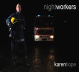
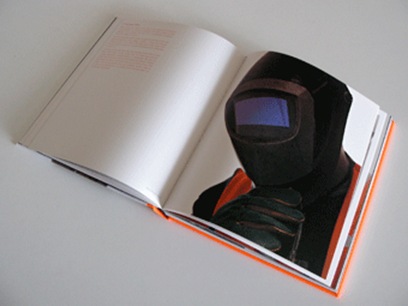
My book came back from Blurb a short time ago and I am reasonably pleased with the results. The front cover works well – I used the photograph of the firefighter taken during the Travel Project as I thought it was the strongest image for the cover.

book design 01

The type works well and is unobtrusive.

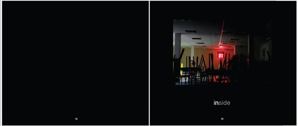
Inside the book, I feel I have left too many blank pages at the beginning and the end.  I did this because I have seen this in other books, but next time I will cut out two pages in the front and back.

I kept the inside type at 30% which works well, but in retrospect, I may make it slightly smaller next time.    However, the black pages have come out dark grey, which, at first, I was upset about, but now I think they work well as the photographs do not meld into the background and become ‘lost’. 

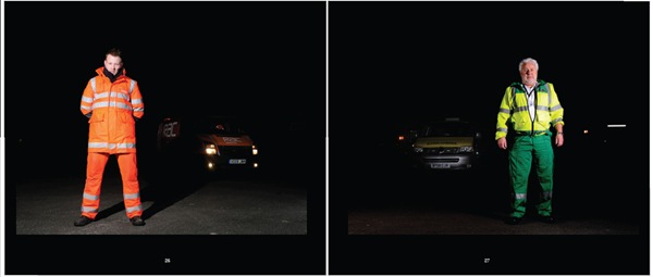
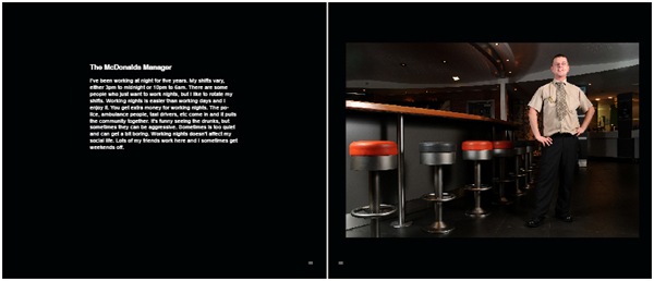
The photographs appear flatter in the book than they are, but this is normal.  Some of the participants did not give me an interview and the opposite pages look empty (waiting to be filled).  In some cases, I have put two photographs on opposite pages, facing each other, which worked very well, but in other cases, the photographs didn’t ‘fit’ together, so I put them on separate pages. I feel that I should have put all the non-interviewees on facing pages, which would also help to break the continuity of the book more.  I also wish I had removed the prison officer photograph, as I don’t think it works well with the other images. 

I was worried about the size of the book, but I think it is fine.  For the exhibition in January, however, I will produce more books (with the improvements stated above), but this time smaller, as they will be cheaper to produce.

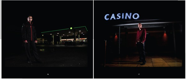
The night photographs used to break up the book work well.  I regret not having the chance to photograph the star trails, but all these image have an ‘urban’ feel and look good.

On the whole, the book is what I was trying to achieve, but I think it can be improved.  It is difficult when designing a book for the first time and using new software to know what you are going to get and in future, I will ensure that I make a ‘test’ book with Blurb, so I can see the final result before I order the final book.  The maquette was very helpful, but I feel that until you have the real book in front of you, you can’t really see what works and what needs to be improved.

Friday, 23 April 2010

Dewi Lewis Critique

Dewi Lewis visited the University of Bolton yesterday to look at our work.  He made the following comments:

  • No subtitles required in the book - which I am glad about.  I didn't like them anyway!
  • It was a good project and I was very close on it.
  • It would have been better if I had found some 'quirky' nightworkers - people who do more unusual jobs.
  • Getting a balance of images in the book - the exterior shots are fine, but the sequencing of the internal images - light v dark needs looking at.
  • Turn the grey text down from 50% to 20%-30%.
  • Consider the size.  Usually books will be 240-245 mm wide, but said it would be OK to do the larger book for the project.

Tuesday, 20 April 2010

Book Maquette

I have now completed my book maquette.  I am pleased with the results.  Obviously, I’m not a graphic designer, so it’s possibly full of little faults that I haven’t picked up on.

In the book, I will include the job titles in the contents page, but they will not accompany the images in the book as I don’t want to make it too obvious what the different people do for a job (apart from the fireman and policeman). Some pictures may be dropped from the book, but overall, I am pleased with the way  the pictures look together and am looking forward to speaking with Dewi Lewis on Thursday, who will no doubt, offer an invaluable critique and advice.

I hope to send the book off to Blurb on Saturday, so I hope there’s not too much more work to be done.

Thursday, 8 April 2010

Book Size

As I’m doing a Blurb book, I only have a limited choice of sizes.  I will either go for:

book design 01 

Standard Landscape – 10 x 8 inches


 book design 01


Large Landscape – 13 x 11 inches 


I have designed the book as a Standard Landscape so far and it won’t take too much trouble to redo it in the larger format.  However, I can’t decide.  The 10x8 seems a little too small and the 13x11 seems too big.  The big book will have more impact, but the smaller book will be easier to read/carry, etc.  I will seek advice from my tutor about this.

Wednesday, 7 April 2010

Blurb Photography Book Now Competition

Blurb has a book competition which I will enter with my Blurb book.

The following is from their website:
Photography Book Now 2010 is here, and the call for entries is on!
Photography Book Now is a celebration of the most creative and innovative photography books, and the people behind them. This is your chance for international recognition and a shot at the $25,000 Grand Prize. The winning books will become a part of a permanent collection housed at the George Eastman House, International Center of Photography, and Annenberg Space for Photography.
We’re accepting submissions for the third annual competition now, and we want to see your best work. Last year we had more than 2,000 submissions from 45 countries. This year we’re hoping for even more from Blurbarians worldwide. Darius Himes returns as lead judge, along with a panel of world-renowned editors, publishers, and photographers including:
  • Monica Allende, London Sunday Times
  • David Fahey, Fahey/Klein
  • Michael Mack, Steidl/Mack
  • Lesley A. Martin, Aperture
  • Susan Meiselas, Photographer
  • Erin O’Toole, San Francisco MoMA
  • Martin Parr, Photographer
  • Judith Puckett-Rinella, New York Times T Magazine
  • Brian Smith, Photographer
So head on over to the website and submit your photography book. We can’t wait to see what you’ve got.

Assigning and Converting Colour Spaces

All this colour management is difficult to understand.  I’ve found the following helpful from:

http://www.pdnonline.com/pdn/cp/olympus/technology/article_display.jsp?vnu_content_id=1003051994

Assigning Profiles

The main goal of assigning an ICC profile to an image is to tell Photoshop what the RGB (or CMYK) values mean, so that the colours and tones in your image can be displayed as accurately as possible. When you assign a profile you are not changing the red, green, and blue code values; rather, you’re changing how those values are interpreted by Photoshop, and how the image will appear.

To tell Photoshop what the RGB values mean, launch the “Assign Profile” window from “Edit” in the menu bar in Photoshop CS2 or from “Image” then ”Mode” in Photoshop 6, 7 and CS.  As you select different profiles in this pull-down interface with the Preview checked, you will notice that the image visibly changes with each profile selected. Each profile tells Photoshop that the RGB values in the image correspond to different tones and colours or Lab values.

The goal of assigning a profile is to tell Photoshop what the RGB values mean so that the colours and tones of an image can be displayed as accurately as possible.

Practical reasons to assign a profile include:

  1. Missing Color Space Profiles from Digital Camera or Other Files: If a digital camera does not embed a working color space to its jpeg files or the file you are opening doesn’t have an embed a profile, but you know the images are processed to sRGB, AdobeRGB(1998), or a generic RGB, just assign the sRGB, AdobeRGB(1998), or generic RGB to get the color right.
  2. Improved Accuracy from Input Devices: By assigning custom scanner profiles to their corresponding images, you get improved color matches to the original prints or transparencies you are scanning. By assigning custom digital camera/light source profiles to their corresponding images, you can get colors that better match the colors of the original scene.

However, you should NOT assign a printer or output profile from a lab or a printer or paper manufacturer. This is when you use the “Convert to Profile” tool.

Converting to Profiles

As opposed to assigning a profile, when you perform a conversion you go from one colour space into another. Here, the goal is to change the RGB values, so that the colours are kept the same.

To convert an image in Photoshop we launch the “Convert to Profile” window from Edit in the menu bar. 

In performing a conversion, we have three options.

  1. The first is the colour engine or colour management module (CMM). This does the math under the hood when a conversion is performed. At the moment this selection does not have a big impact on the conversion and Adobe (ACE) is a good general choice.
  2. The second option is rendering intent. The rendering intent controls gamut compression or how in-gamut colours, that can be reproduced, are handled during a conversion. Out-of-gamut colours, that can’t be reproduced, are always brought into the gamut of our destination space, but with photographic images we have two choices for handling the in-gamut colours:
    1. We can shift the in-gamut colours to maintain the overall relationship of colours, called Perceptual, or
    2. We can keep the in-gamut colours unchanged or as close as possible, which is called Relative Colorimetric. Using the Preview check box, you can decide which intent you prefer for the image(s).
  3. The final options are two check boxes. “Use Black Point Compensation” is checked to help maintain shadow detail. It is especially important to have this checked with colorimetric rendering intents. “Use Dither” is checked to help maintain smoothness in gradations, like the sky of this image.

Practical reasons to convert to a profile could include:

  1. Putting Images into Working Color Spaces: Before working on images in Photoshop, it is better to have them in standard, independent, neutral colour spaces, like sRGB, ColorMatchRGB, or Adobe(RGB). One reason is so that the Info Palate’s RGB values will have more meaning. When the red, green, and blue values are equal in one of these spaces the colour is a true neutral. If you are in a device space, such as scanner or monitor space, this is, most likely, not the case and values can’t be used.
  2. Preparing Images for Lab Printing: As I discussed in my May article, you can convert using your lab’s printer and paper profile before sending images. But remember it’s important to tell them not to make any adjustments or conversions to these images once you have already converted them.
  3. Preparing Images for the Web: If you are saving files for the Web, it’s best to convert the images to sRGB, which is currently the standard colour space for this industry. Make sure to embed the profile when saving the image.

Another place Photoshop performs conversions is in the “Print with Preview” window. You select the option “Let Photoshop Determine Colours” under the Colour Management tab and select the printer paper profile. This could be a generic profile or, preferably, a custom profile built by you or a professional. The conversion to the printer and paper colour space happens on the fly as you send the image to the printer. This will help you get the best match from monitor to your printer and paper combination.

How to Colour Prep the Book in InDesign for Blurb

The following is taken from the Blurb website:

 http://blurb.custhelp.com/app/answers/detail/a_id/451/kw/srgb/r_id/166

Our digital printers use the standard four color print process that most every printing press uses: CMYK, which stands for cyan, magenta, yellow, and black.

These four colors are combined to give you the full-color reproduction you expect with printed materials. Monitors and digital images use a different color space called RGB, which stands for red, green, and blue.

The recommended Color Space for Blurb's PDF to Book workflow is CMYK. This will give you the best monitor soft proof representation and the most reliable print results. Use a CMYK color palette for native graphics and text within InDesign® or your layout tool. The digital presses we use are unable to process spot color at this time and that means spot colors will cause problems when files are flattened due to the use of transparency. So, be sure to convert any spot color to CMYK whether in a Graphics Application like Adobe Illustrator® or in a layout tool like Adobe® InDesign®.

•  If you prefer to work in the RGB Color Space, we recommend the sRGB Color Space for all of your images. You can soft proof them using the Blurb ICC Profile.

•  If you have already converted your images to sRGB you can either keep them sRGB or convert to the Blurb ICC Profile. If your images are already sRGB, it is not necessary to convert to CMYK because the HP Indigo is preset to convert sRGB to CMYK. Just be aware that there will be a slight color shift when this conversion takes place.

• If your images are Adobe RGB, ProPhoto RGB, Colormatch RGB, or another RGB color space, the optimal workflow is to convert your images to the Blurb ICC Profile optimized for the HP Indigo presses that Blurb uses. Color conversion is best done via an imaging program, such as Adobe® Photoshop®, prior to placing your images or graphics into Adobe® InDesign® or your preferred layout tool. Install the Blurb ICC Profile and convert your images to CMYK using the profile.

• If your images are already CMYK, you also should not convert back to RGB or a different CMYK space. If you choose to do so, there is only a small gain in color vibrancy and much more degradation of the file for the amount of effort needed.

So either work in CMYK or sRGB.  I am working in sRGB, so according to this, they will be OK.

Monday, 5 April 2010

Book Design

In the last post, I had decided to drop the interview text for my book.  However … I have been thinking of adding it to the end of the book – all interviews in one block.  As a few of them weren’t interviewed, I decided the continuity would look awful if I had interviews on some pages and not on others.

However …………  I have looked at Brian Griffin’s book ‘Team’ and I will try it like this:

brian griffin team.jpg It’s very subtle and doesn’t interfere with the impact of the photographs.  I will probably do the text in light grey.  I have also found a solution for those nightworkers I didn’t interview – I will fit two images facing each other.  This will, as I have stated, solve the problem of having a blank page where others have text and also ‘break up’ the book a little to stop it stagnating.

I also love the book cover – no text at all.  Why not?  I’ll also try this and see what it looks like.

brian griffin team cover brian griffin team cover 02

  The cover of his catalogue has great impact.

One of Griffin’s other books ‘Work’ also has an interesting front cover which incorporates the text.

brian griffin work

Sunday, 28 March 2010

Maquette #2

I also had to look at colour management which was a bit tricky at first, but I think I’ve got the gist of it.  For Blurb, I have to make sure my images are sRGB profiled.  I can also use a profile that Blurb have suggested, but it’s not necessary if the images are sRGB’s as their systems will convert it from the pdf. 
So this is how it looks so far.  I have looked at a number of photography books for ideas.  The front cover is the same as before as I think the image used suits it very well.  The contents page is as follows:
contents
 
I have also split the book into three sections, mainly because a lot of my images contained people wearing high visibility jackets.  Originally, I was going to split them up within the book, but now I think I will devote a section to them.  I got this idea from Trevor Appleson's book 'Free Ground' where his chapters contains portraits of people under the headings 'Beaches' and 'Uniforms'.
I will use the pictures I take of ‘the night’ to illustrate these sections.
hiviz

page2 
Apart from the high visibility section, there is also a section on photographs taken of workers who work inside, so I have creatively called it ‘inside’.

insidepage1  
The problem is what to do with the rest of the images.  I have called another section ‘inside out’ as the workers are photographed outside, but they work inside, but the problem is what to do with the taxi driver? I like this photo and don’t want to leave it out of the book.

page3

I have also experimented with putting an image on each page, rather than on alternate pages, as I noticed that the pictures married up in twos quite well.  This will bring the page numbers down and I originally wanted to create a sense of space and dark which came from having the left-hand page blank and may well go back to this format.  At the moment, there are 50 pages in the book, but I still intend to photograph a few more people.  I wish I could attach the pdf of the book to this blog, but I can’t.  That way, you would be able to see the whole design.
The design of the book is very simple.  I am not a designer, so don’t want to attempt anything over-ambitious for a first attempt.  I also like photography books that are simple, with no gimmicks, as I feel they detract from the content and get a bit annoying after a while.
I have also been looking at book size.  Originally, I decided on 13”x11”, but I cut this size out on a piece of paper and it looked enormous.  I couldn’t imagine sitting on the sofa comfortably flicking through a book that big.  The other Blurb size is 10”x8” which seems a bit small (you can’t win, can you?!) and it is difficult to imagine what the finished article will be like.  I don’t want to get the layout and book size wrong as I will deeply regret it.
I’ve also thought about some of the more stronger images flowing over two pages, but this isn’t possible within the template.  To be honest, I dislike this, as you end up with two bits of one picture instead of being able to look at the whole image on one page without bending back the spine.
I have also decided to drop the interview text.  I don’t think it looks good next to the images and where else are you supposed to put it.  I don’t want to book to be too ‘wordy’, but it may be interesting for the reader to include the interviews, maybe at the back of the book, so the reader can enjoy the photographs, but read the interviews later.  Also, not everyone I photographed was interviewed as there wasn’t enough time, so the book would look ungainly if some text was included with some pictures and some not.

Saturday, 6 February 2010

Maquette

I have had a bash at the first design of my book.  It looks OK, but could do with a little tweaking.  I have left two blank pages at the front and two at the back, but the rest is as follows:

front cover 

These pages do not have white borders, it is just to make them stand out from this page. 

page 2 
I looked through a few photobooks on the Blurb website and got a few ideas.

page 3

This is the contents page which may spread over onto two pages when I have shot all my pictures.

page 4

I am going to write an introduction to the book, outlining the reasons why I decided to photograph nightworkers.

The following are the photo pages.  I have laid all photographs out on the right-hand page and the little interviews on the left.  I’m not sure about the positioning of the text yet and this will probably change.  As you can see, there is more text on some pages than others, and I would like this to be balanced on each page without ruining the continuity.  I don’t want it to be a difficult and annoying book to read.
page 5
page 6
page 7
page 8
This photograph on this page is lighter than the others because it was shot indoors.  I will put the lighter images to the rear of the book, so the images are gradually getting lighter as you read.
page 9
I decided to put thumbnails of all images at the back of the book.  Obviously, I haven’t got enough images yet, but this is what it will look like when it’s finished.  Hopefully I’ll have more than 18 images.
page 10
At the back of the book, I will put some of my extended essay about nightworkers.  The essay will not be fully finished by the time the book goes to print, but I’ll do what I can.

Not sure if 33cm x 28cm is rather large for this photo book.  I've actually printed it out at 29cm x 24cm which looks OK, but it's not a Blurb size (just in case I want to go down the Blurb route).  Blurb do  a 10x8 size (25cm x 20cm) which may be fine.

Tuesday, 2 February 2010

Andy Boag – 25 Years On

book Andy printed his book through Blurb and I think it looks great.

There’s a lot of text in the book, which I may or may not do myself (probably not), but it is laid out nicely and is easy to read.


The book’s got a contents page introducing readers to the colliers inside.

book1

And an introduction of why the book has been made.

book2

He’s also got text by Tony Benn and Billy Bragg.

book3

The interviews with the colliers are in-depth.

book4

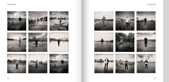
I like these pages at the back, showing all the colliers’ images together.

book5

Andy managed to get 27 people to photograph, interviewed and photographed Tony Benn and Billy Bragg and produced a great book.  I’m getting very worried about my project.

Gary Badger’s Top 10 Photobooks

Again, this was in the BJP in December.  Gary Badger is  co-author of ‘The Photobook:  A History’ with Martin Parr.  Here is the article:

  Despite the frequently expressed, gloomy prognosis about the health of the book and the future of the printed page, one area of publishing seems to flourish unabated. Indeed, interest in the photobook has never been higher and is, if anything, intensifying, at a time when photography is subject to great sea changes and a marked degree of uncertainty, especially in traditional editorial markets.

Not all of the publishing activity is with 'regular' publishers. Indeed, large mainstream publishers such as Thames and Hudson and Phaidon, have reined in their photo-publishing programmes, sticking to tried-and-trusted names. The small independents, who are lead by the inimitable Steidl (if Steidl can be called 'small') and for whom a 1500 to 200 print-run is the norm, remain the bedrock of photographic publishing.

As with everything else, the digital revolution has made an enormous impact though. Thanks to online print to order companies such as Blurb, making a photobook is now within everyone's reach. We haven't seen the first online classic but we soon will, and at the very least online printing allows photographers to make great calling cards for regular publishers.

In the last ten years some extraordinary photobooks have been published. Picking out ten to showcase as the 'best' can only be a matter of personal preference, and if ten people were doing it perhaps few would be chosen by more than one selector. I might even choose a different ten on a different day.

A number of elements go into making an important photobook. Firstly, the work. It is possible to make a successful book from less than first-rate images, but in general, the better the imagery, the better the book is likely to be. Secondly, the package presenting the work - design, typography, and so on - can make a crucial difference. Thirdly, the sequencing and narrative drive of the book is vital - that, after all, is why photographers make photobooks, to play photographs off against each other, to create a plausible and telling narrative of some kind. Fourthly, there is the 'X factor', where these elements come together to create a special narrative world of their own, making the book stand out both as a physical and intellectual object.

As in any other artform I'm also on the lookout for newness, although not novelty for its own sake. Perhaps I can call it freshness - a pushing of the envelope, a new twist on an old tale. Here, in no particular order, are ten books from the last decade that I feel meet these criteria in an outstanding way.


MOTHER'S - Miyako Ishiuchi, Sokyu-sha, 2002

Ishiuchi's memorial to her dead mother is a complex meditation on loss, memory, history and desire, beautifully realised and packaged.


THE ROMANCE INDUSTRY  - John Gossage, Nazraeli Press, 2002

Gossage demonstrating why he is arguably the best American photobook-maker of the last 30 years.


PRENEZ SOIN DE VOUS  - Sophie Calle, Actes Sud, 2007

Ostensibly a retrospective catalogue but an artist's book of the highest order, complete with DVDs and books within books. Stunning work.


UTATANE - Rinko Kawauchi, Little More, 2002

More enigmatic, diaristic photography, from perhaps the best young Japanese photographer to emerge in the last decade


IN HISTORY - Susan Meiselas, Steidl, 2008

Like Calle, Meiselas takes the retrospective monograph and turns it into a complex history, a diary, a meditation, and a great photobook.

A SHIMMER OF POSSIBILITY - Paul Graham, Steidl, 2008

The decade's most enigmatic photobook, a parcel of 'cinematic haikus' that are about nothing and everything but say a great deal about ordinary life, surely photography's mission.

BAGHDAD CALLING - Geert van Kesteren, Episode Books, 2008

The new photojournalism - a professional photographer using cellphone and 'citizen reporter' images to tell us the truth about post-Saddam life in Baghdad.

TRYING TO DANCE  - JH Engstrom, Journal, 2003

The new, diaristic photography. A journal of everyday life every bit as enigmatic as Paul Graham's, marking the debut of a major new talent.


PARRJECTIV: JEANS HUNTING IN ISTANBUL - Martin Parr, Mavi Jeans, 2006

A 'company' book, made in a few days, but containing great pictures and packaged together strongly. It even has a bellyband


TEMPORARY DISCOMFORT : CHAPTERS I-IV  - Jules Spinatsch, Lars Muller, 2005

A startling, conceptual exploration of how we record history and the contemporary problem of control, public relations and surveillance.

Objects of Desire

Leafing through an old copy of the BJP, I found a piece on the best photobooks of the decade where Martin Parr is asked his opinion.  The following are excerpts from the article which is copyright BJP.

This has been the decade when people have rediscovered the book. And that's been prompted by some important new references, starting with Fotografia Republica, published by Museo Nacional Centro de Arte Reina Sofia to coincide with its exhibition during Photo Espana in 2000 and edited by Horacio Fernandez. It was really the first to publish actual spreads from books and magazines, so we must always credit him for getting the ball rolling. Next was Andrew Roth with The Book of 101 Books (PPP Editions, 2001), whose list was predominantly American, with a few Japanese thrown in. And then of course there was my and Gerry Badger's contribution (The Photobook - A History, published in two volumes by Phaidon in 2005 and 2006), and since then there have been many others.

So suddenly the status of the book has improved dramatically and people now take it a lot more seriously as a contributing factor to our understanding of photographic culture. I have always maintained its significance, being a photographer and knowing that I and other photographers always cite books as their inspiration. History is so subjective; it's constantly in flux. It's usually written by theorists and academics, who don't have the same regard for the photographic book that photographers do. So we think of our (Parr and Badger's) contribution as being a revision of history, taking on board many books and photographers that have been somewhat marginalised and overlooked, and bringing them to the attention of a wider audience.

BETTER BY DESIGN

First off, a good book consists of great pictures. Secondly, you've got to have the production and the narrative that really makes those pictures come through to the viewer most effectively. Every aspect of the book has to be working in its favour. One of the criteria I've used here, in my selection of books from the past decade, is whether the book explores different ways of printing, different narratives and different looks and feels. The way that Dash Snow organised his books is integral to the understanding of his work. Others are more traditional. Rinko Kawauchi's book, Utatane, is not dynamic in terms of production values, but the photographs are nonetheless beautifully laid out and simple to read.

Photographers and designers are exploring creative possibilities a lot more, but all we're doing really is catching up with the great achievements of the Japanese. They were doing all this in their post-war publishing period in a way that was so far ahead of the west it was quite remarkable. The thing that still completely stuns me is that we chose to ignore this. So until I went there in 1992, I had no idea how spectacular the books were. I'd seen the work of many of the photographers, in books such as Mark Holborn's Black Sun: The Eyes of Four, Roots and Innovation in Japanese Photography (published by Aperture in 1986) and curated into shows such as John Szarkowski's New Japanese Photography in 1974, and I liked the pictures. But it's only when you see the books that you realise how amazing they were as vehicles for ideas within photography.

Now we've caught up, and the design aspects of books are so much bolder and more adventurous than in the 1960s and 70s. That was the great heyday of American photography but the books they were producing were not as exciting as the actual work, and you'd have two white pages with a picture on the right. At the same time, the Japanese were exploring full bleed, special cuts and all kinds of other things. Occasionally in Europe and America you'd have someone like William Klein in 1956, who would tear up these rules and do something radical, but in general we were much more conservative. Now the playing field is much more level and we are learning what the Japanese learnt 30 or 40 years ago. This is evident in some of the books in this selection.

We need and require mainstream publishers, but their books tend to be a lot more conservative. So the real workshop, and the place where people can experiment with ideas, is small publishers, or indeed self-publishing. The quality and variety of print-on-demand books is improving. When people like Blurb first appeared they too were very conservative, but they are constantly improving. In another 10 years time, you'll find many more photographers self-publishing their own Blurb books.

One thing that's problematic with all this is that all photographers believe they deserve a book, and that it will have a dramatic affect on their careers. Sadly, very few of these books capture the imagination and become a cult item. For most books, if you sell 500 you're very lucky. Few have the momentum of some of the books here, which are celebrated and collected and known as being important signposts in photographic publishing.

The reason Japan was so successful in the post-war Provoke period was that designers were literally given pictures by photographers and asked to come up with the ideas. Total collaboration with amazing designers such as Tadanori Yokoo allowed photographers to create these incredibly exciting books. But the potential is still underexploited - as is the capacity to be bold, to be exciting, and to really think and problem solve. It's getting the balance right. You've got to have the right project and the right vehicle to bring it to its full potential, and that's not such an easy thing to determine. Photography is often a problem-solving exercise and so is making a book, thinking of ways of making the work you've got come out and sing on the page more effectively. So often conservative design holds things back.

MARTIN’S FAVOURITES

All the books listed here have fantastic images and superb production values that make them, and become classics in their own time. Often quite radical, and therefore sometimes only appreciated after some time, they are all bound to go down as big contributors to our ongoing photographic book culture.

THE KIDS ARE ALRIGHT - Ryan McGinley, self-published, 2000

McGinley almost single-handedly revitalised American photography in a way Nan Goldin had done 15 years earlier, with his images of his friends having a wild and wonderful time. This edition of 100 was a shining beacon of how a small self-published book can announce the arrival of a major new talent.

 PRETEND YOU'RE ACTUALLY ALIVE - Leigh Ladare, ppp Editions, 2008

This beautifully-produced book shows the fascinating relationship between the photographer and his mother, an ex ballet dancer. A searing investigation of a strange and sometimes sexually charged connection, it combines notebooks and photographs and remains gloriously ambiguous.

BERLIN: IN THE TIME OF THE WALL - John Gossage, Loosestrife, 2004

Gossage is one of the true original voices in photography. He spent many months exploring Berlin in the 1980s, and this tome is an index of urban possibilities with photography. Never too dramatic and always fresh and original, it is a remarkable journey around the wall, in the run up to its welcome demise.

FLAMBOYA  - Viviane Sassen, Contrasto, 2008

Sassen was brought up in Mozambique and has returned to Africa to shoot these strange and graphic portraits. Sometimes posed and sometimes caught, these photographs are combined with a stunning design, in which many of the pages are cut, to produce a strange and compelling book. Her portraits are so original it is difficult to place them.

UTATANE - Rinko Kawauchi, Little More, 2001

From time to time a new photographer arrives on the scene who is difficult to classify. Kawauchi is one such photographer. Her images are so fresh, so simple and original, it almost defies belief. Utatane translates as siesta, which does give you a clue about her images' dreamlike quality. This book has been reprinted many times and Kawauchi is now known and appreciated internationally.

SLIME THE BOOGIE - Dash Snow, Peres Projects, 2007

In his short creative life (he died earlier this year at the age of 27), Dash Snow re-invented how the book and the zine looked and felt. Usually surrounded by matt black ink, he juxtaposed images of his friends with newspapers and Polaroids in both colour and black-and-white. Slime the Boogie was published in a limited edition of 300, and is the best of his books.

CHECKED BAGGAGE - Christien Meindertsma, Soeps Uitgevererij, 2004

This remarkable conceptual project documents 3624 objects Meindertsma bought at auction for EUR200. All of them had been confiscated at Schipol airport during the stringent security checks initiated after 9/11. The book was published in an edition of roughly 1000, and one of the featured objects was given away free with each copy.

HACKNEY WICK - Stephen Gill, Nobody, 2005

This book was the second Gill self-published, and started a remarkable run of publications by one of Britain's newest and most ingenious photographic talents. It features images of a Hackney market taken on a 50p plastic lens camera sourced at the very same place.

WHY MISTER WHY - Geert van Kesteren, Artimo, 2004

This is the most compelling new book to deal with war in the last ten years, and has a feel of a magazine, with thin paper and serrated edges that all add to its immediacy. The title comes from the phrase that van Kesteren heard shouted at him many times as moved round Iraq.

A SHIMMER OF POSSIBILITY - Paul Graham, Steidl/Mack, 2007

Graham is a restless photographer, and is constantly thinking up new ways to represent the world. This book, which consists of 12 separate narratives in 12 separate volumes, was universally applauded on publication.