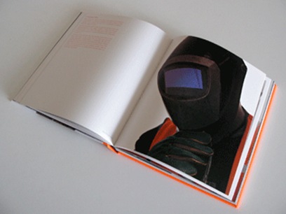
In the last post, I had decided to drop the interview text for my book. However … I have been thinking of adding it to the end of the book – all interviews in one block. As a few of them weren’t interviewed, I decided the continuity would look awful if I had interviews on some pages and not on others.
However ………… I have looked at Brian Griffin’s book ‘Team’ and I will try it like this:

I also love the book cover – no text at all. Why not? I’ll also try this and see what it looks like.
 |  |
The cover of his catalogue has great impact.
One of Griffin’s other books ‘Work’ also has an interesting front cover which incorporates the text.


