I have had a bash at the first design of my book. It looks OK, but could do with a little tweaking. I have left two blank pages at the front and two at the back, but the rest is as follows:

These pages do not have white borders, it is just to make them stand out from this page.

I looked through a few photobooks on the Blurb website and got a few ideas.
This is the contents page which may spread over onto two pages when I have shot all my pictures.
I am going to write an introduction to the book, outlining the reasons why I decided to photograph nightworkers.
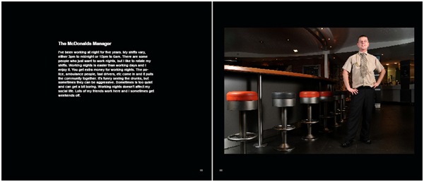
The following are the photo pages. I have laid all photographs out on the right-hand page and the little interviews on the left. I’m not sure about the positioning of the text yet and this will probably change. As you can see, there is more text on some pages than others, and I would like this to be balanced on each page without ruining the continuity. I don’t want it to be a difficult and annoying book to read.
This photograph on this page is lighter than the others because it was shot indoors. I will put the lighter images to the rear of the book, so the images are gradually getting lighter as you read.
I decided to put thumbnails of all images at the back of the book. Obviously, I haven’t got enough images yet, but this is what it will look like when it’s finished. Hopefully I’ll have more than 18 images.
At the back of the book, I will put some of my extended essay about nightworkers. The essay will not be fully finished by the time the book goes to print, but I’ll do what I can.
Not sure if 33cm x 28cm is rather large for this photo book. I've actually printed it out at 29cm x 24cm which looks OK, but it's not a Blurb size (just in case I want to go down the Blurb route). Blurb do a 10x8 size (25cm x 20cm) which may be fine.


