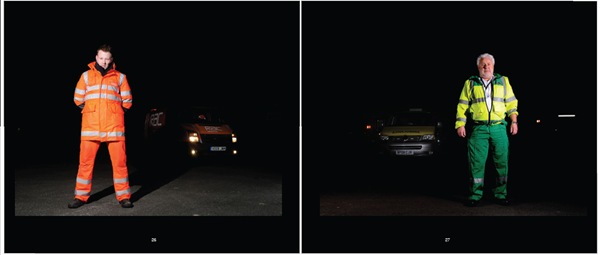
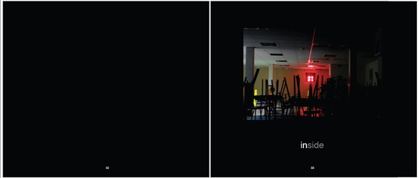
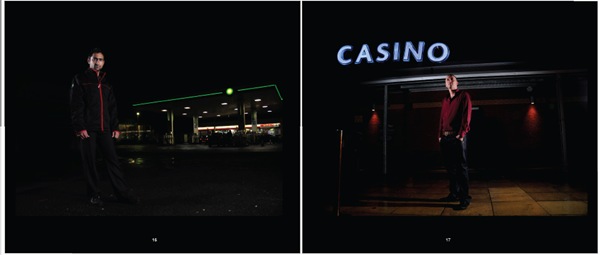
I’ve had another bash a the maquette and have learned a few things along the way. I have decided to go with Blurb and downloaded an InDesign template to work from.
I also had to look at colour management which was a bit tricky at first, but I think I’ve got the gist of it. For Blurb, I have to make sure my images are sRGB profiled. I can also use a profile that Blurb have suggested, but it’s not necessary if the images are sRGB’s as their systems will convert it from the pdf.
So this is how it looks so far. I have looked at a number of photography books for ideas. The front cover is the same as before as I think the image used suits it very well. The contents page is as follows:
I have also split the book into three sections, mainly because a lot of my images contained people wearing high visibility jackets. Originally, I was going to split them up within the book, but now I think I will devote a section to them. I got this idea from Trevor Appleson's book 'Free Ground' where his chapters contains portraits of people under the headings 'Beaches' and 'Uniforms'.
I will use the pictures I take of ‘the night’ to illustrate these sections.

Apart from the high visibility section, there is also a section on photographs taken of workers who work inside, so I have creatively called it ‘inside’.

The problem is what to do with the rest of the images. I have called another section ‘inside out’ as the workers are photographed outside, but they work inside, but the problem is what to do with the taxi driver? I like this photo and don’t want to leave it out of the book.
I have also experimented with putting an image on each page, rather than on alternate pages, as I noticed that the pictures married up in twos quite well. This will bring the page numbers down and I originally wanted to create a sense of space and dark which came from having the left-hand page blank and may well go back to this format. At the moment, there are 50 pages in the book, but I still intend to photograph a few more people. I wish I could attach the pdf of the book to this blog, but I can’t. That way, you would be able to see the whole design.
The design of the book is very simple. I am not a designer, so don’t want to attempt anything over-ambitious for a first attempt. I also like photography books that are simple, with no gimmicks, as I feel they detract from the content and get a bit annoying after a while.
I have also been looking at book size. Originally, I decided on 13”x11”, but I cut this size out on a piece of paper and it looked enormous. I couldn’t imagine sitting on the sofa comfortably flicking through a book that big. The other Blurb size is 10”x8” which seems a bit small (you can’t win, can you?!) and it is difficult to imagine what the finished article will be like. I don’t want to get the layout and book size wrong as I will deeply regret it.
I’ve also thought about some of the more stronger images flowing over two pages, but this isn’t possible within the template. To be honest, I dislike this, as you end up with two bits of one picture instead of being able to look at the whole image on one page without bending back the spine.
I have also decided to drop the interview text. I don’t think it looks good next to the images and where else are you supposed to put it. I don’t want to book to be too ‘wordy’, but it may be interesting for the reader to include the interviews, maybe at the back of the book, so the reader can enjoy the photographs, but read the interviews later. Also, not everyone I photographed was interviewed as there wasn’t enough time, so the book would look ungainly if some text was included with some pictures and some not.


