Tuesday, 25 May 2010

My Book

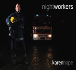
My book came back from Blurb a short time ago and I am reasonably pleased with the results. The front cover works well – I used the photograph of the firefighter taken during the Travel Project as I thought it was the strongest image for the cover.

book design 01

The type works well and is unobtrusive.

Inside the book, I feel I have left too many blank pages at the beginning and the end.  I did this because I have seen this in other books, but next time I will cut out two pages in the front and back.

I kept the inside type at 30% which works well, but in retrospect, I may make it slightly smaller next time.    However, the black pages have come out dark grey, which, at first, I was upset about, but now I think they work well as the photographs do not meld into the background and become ‘lost’. 

The photographs appear flatter in the book than they are, but this is normal.  Some of the participants did not give me an interview and the opposite pages look empty (waiting to be filled).  In some cases, I have put two photographs on opposite pages, facing each other, which worked very well, but in other cases, the photographs didn’t ‘fit’ together, so I put them on separate pages. I feel that I should have put all the non-interviewees on facing pages, which would also help to break the continuity of the book more.  I also wish I had removed the prison officer photograph, as I don’t think it works well with the other images. 

I was worried about the size of the book, but I think it is fine.  For the exhibition in January, however, I will produce more books (with the improvements stated above), but this time smaller, as they will be cheaper to produce.

The night photographs used to break up the book work well.  I regret not having the chance to photograph the star trails, but all these image have an ‘urban’ feel and look good.

On the whole, the book is what I was trying to achieve, but I think it can be improved.  It is difficult when designing a book for the first time and using new software to know what you are going to get and in future, I will ensure that I make a ‘test’ book with Blurb, so I can see the final result before I order the final book.  The maquette was very helpful, but I feel that until you have the real book in front of you, you can’t really see what works and what needs to be improved.

Friday, 23 April 2010

Dewi Lewis Critique

Dewi Lewis visited the University of Bolton yesterday to look at our work.  He made the following comments:

  • No subtitles required in the book - which I am glad about.  I didn't like them anyway!
  • It was a good project and I was very close on it.
  • It would have been better if I had found some 'quirky' nightworkers - people who do more unusual jobs.
  • Getting a balance of images in the book - the exterior shots are fine, but the sequencing of the internal images - light v dark needs looking at.
  • Turn the grey text down from 50% to 20%-30%.
  • Consider the size.  Usually books will be 240-245 mm wide, but said it would be OK to do the larger book for the project.

Tuesday, 20 April 2010

Book Maquette

I have now completed my book maquette.  I am pleased with the results.  Obviously, I’m not a graphic designer, so it’s possibly full of little faults that I haven’t picked up on.

In the book, I will include the job titles in the contents page, but they will not accompany the images in the book as I don’t want to make it too obvious what the different people do for a job (apart from the fireman and policeman). Some pictures may be dropped from the book, but overall, I am pleased with the way  the pictures look together and am looking forward to speaking with Dewi Lewis on Thursday, who will no doubt, offer an invaluable critique and advice.

I hope to send the book off to Blurb on Saturday, so I hope there’s not too much more work to be done.

Thursday, 8 April 2010

Book Size

As I’m doing a Blurb book, I only have a limited choice of sizes.  I will either go for:

book design 01 

Standard Landscape – 10 x 8 inches


 book design 01


Large Landscape – 13 x 11 inches 


I have designed the book as a Standard Landscape so far and it won’t take too much trouble to redo it in the larger format.  However, I can’t decide.  The 10x8 seems a little too small and the 13x11 seems too big.  The big book will have more impact, but the smaller book will be easier to read/carry, etc.  I will seek advice from my tutor about this.

Wednesday, 7 April 2010

Blurb Photography Book Now Competition

Blurb has a book competition which I will enter with my Blurb book.

The following is from their website:
Photography Book Now 2010 is here, and the call for entries is on!
Photography Book Now is a celebration of the most creative and innovative photography books, and the people behind them. This is your chance for international recognition and a shot at the $25,000 Grand Prize. The winning books will become a part of a permanent collection housed at the George Eastman House, International Center of Photography, and Annenberg Space for Photography.
We’re accepting submissions for the third annual competition now, and we want to see your best work. Last year we had more than 2,000 submissions from 45 countries. This year we’re hoping for even more from Blurbarians worldwide. Darius Himes returns as lead judge, along with a panel of world-renowned editors, publishers, and photographers including:
  • Monica Allende, London Sunday Times
  • David Fahey, Fahey/Klein
  • Michael Mack, Steidl/Mack
  • Lesley A. Martin, Aperture
  • Susan Meiselas, Photographer
  • Erin O’Toole, San Francisco MoMA
  • Martin Parr, Photographer
  • Judith Puckett-Rinella, New York Times T Magazine
  • Brian Smith, Photographer
So head on over to the website and submit your photography book. We can’t wait to see what you’ve got.

Assigning and Converting Colour Spaces

All this colour management is difficult to understand.  I’ve found the following helpful from:

http://www.pdnonline.com/pdn/cp/olympus/technology/article_display.jsp?vnu_content_id=1003051994

Assigning Profiles

The main goal of assigning an ICC profile to an image is to tell Photoshop what the RGB (or CMYK) values mean, so that the colours and tones in your image can be displayed as accurately as possible. When you assign a profile you are not changing the red, green, and blue code values; rather, you’re changing how those values are interpreted by Photoshop, and how the image will appear.

To tell Photoshop what the RGB values mean, launch the “Assign Profile” window from “Edit” in the menu bar in Photoshop CS2 or from “Image” then ”Mode” in Photoshop 6, 7 and CS.  As you select different profiles in this pull-down interface with the Preview checked, you will notice that the image visibly changes with each profile selected. Each profile tells Photoshop that the RGB values in the image correspond to different tones and colours or Lab values.

The goal of assigning a profile is to tell Photoshop what the RGB values mean so that the colours and tones of an image can be displayed as accurately as possible.

Practical reasons to assign a profile include:

  1. Missing Color Space Profiles from Digital Camera or Other Files: If a digital camera does not embed a working color space to its jpeg files or the file you are opening doesn’t have an embed a profile, but you know the images are processed to sRGB, AdobeRGB(1998), or a generic RGB, just assign the sRGB, AdobeRGB(1998), or generic RGB to get the color right.
  2. Improved Accuracy from Input Devices: By assigning custom scanner profiles to their corresponding images, you get improved color matches to the original prints or transparencies you are scanning. By assigning custom digital camera/light source profiles to their corresponding images, you can get colors that better match the colors of the original scene.

However, you should NOT assign a printer or output profile from a lab or a printer or paper manufacturer. This is when you use the “Convert to Profile” tool.

Converting to Profiles

As opposed to assigning a profile, when you perform a conversion you go from one colour space into another. Here, the goal is to change the RGB values, so that the colours are kept the same.

To convert an image in Photoshop we launch the “Convert to Profile” window from Edit in the menu bar. 

In performing a conversion, we have three options.

  1. The first is the colour engine or colour management module (CMM). This does the math under the hood when a conversion is performed. At the moment this selection does not have a big impact on the conversion and Adobe (ACE) is a good general choice.
  2. The second option is rendering intent. The rendering intent controls gamut compression or how in-gamut colours, that can be reproduced, are handled during a conversion. Out-of-gamut colours, that can’t be reproduced, are always brought into the gamut of our destination space, but with photographic images we have two choices for handling the in-gamut colours:
    1. We can shift the in-gamut colours to maintain the overall relationship of colours, called Perceptual, or
    2. We can keep the in-gamut colours unchanged or as close as possible, which is called Relative Colorimetric. Using the Preview check box, you can decide which intent you prefer for the image(s).
  3. The final options are two check boxes. “Use Black Point Compensation” is checked to help maintain shadow detail. It is especially important to have this checked with colorimetric rendering intents. “Use Dither” is checked to help maintain smoothness in gradations, like the sky of this image.

Practical reasons to convert to a profile could include:

  1. Putting Images into Working Color Spaces: Before working on images in Photoshop, it is better to have them in standard, independent, neutral colour spaces, like sRGB, ColorMatchRGB, or Adobe(RGB). One reason is so that the Info Palate’s RGB values will have more meaning. When the red, green, and blue values are equal in one of these spaces the colour is a true neutral. If you are in a device space, such as scanner or monitor space, this is, most likely, not the case and values can’t be used.
  2. Preparing Images for Lab Printing: As I discussed in my May article, you can convert using your lab’s printer and paper profile before sending images. But remember it’s important to tell them not to make any adjustments or conversions to these images once you have already converted them.
  3. Preparing Images for the Web: If you are saving files for the Web, it’s best to convert the images to sRGB, which is currently the standard colour space for this industry. Make sure to embed the profile when saving the image.

Another place Photoshop performs conversions is in the “Print with Preview” window. You select the option “Let Photoshop Determine Colours” under the Colour Management tab and select the printer paper profile. This could be a generic profile or, preferably, a custom profile built by you or a professional. The conversion to the printer and paper colour space happens on the fly as you send the image to the printer. This will help you get the best match from monitor to your printer and paper combination.

How to Colour Prep the Book in InDesign for Blurb

The following is taken from the Blurb website:

 http://blurb.custhelp.com/app/answers/detail/a_id/451/kw/srgb/r_id/166

Our digital printers use the standard four color print process that most every printing press uses: CMYK, which stands for cyan, magenta, yellow, and black.

These four colors are combined to give you the full-color reproduction you expect with printed materials. Monitors and digital images use a different color space called RGB, which stands for red, green, and blue.

The recommended Color Space for Blurb's PDF to Book workflow is CMYK. This will give you the best monitor soft proof representation and the most reliable print results. Use a CMYK color palette for native graphics and text within InDesign® or your layout tool. The digital presses we use are unable to process spot color at this time and that means spot colors will cause problems when files are flattened due to the use of transparency. So, be sure to convert any spot color to CMYK whether in a Graphics Application like Adobe Illustrator® or in a layout tool like Adobe® InDesign®.

•  If you prefer to work in the RGB Color Space, we recommend the sRGB Color Space for all of your images. You can soft proof them using the Blurb ICC Profile.

•  If you have already converted your images to sRGB you can either keep them sRGB or convert to the Blurb ICC Profile. If your images are already sRGB, it is not necessary to convert to CMYK because the HP Indigo is preset to convert sRGB to CMYK. Just be aware that there will be a slight color shift when this conversion takes place.

• If your images are Adobe RGB, ProPhoto RGB, Colormatch RGB, or another RGB color space, the optimal workflow is to convert your images to the Blurb ICC Profile optimized for the HP Indigo presses that Blurb uses. Color conversion is best done via an imaging program, such as Adobe® Photoshop®, prior to placing your images or graphics into Adobe® InDesign® or your preferred layout tool. Install the Blurb ICC Profile and convert your images to CMYK using the profile.

• If your images are already CMYK, you also should not convert back to RGB or a different CMYK space. If you choose to do so, there is only a small gain in color vibrancy and much more degradation of the file for the amount of effort needed.

So either work in CMYK or sRGB.  I am working in sRGB, so according to this, they will be OK.